Configuring Donut and Pie Charts
Overview
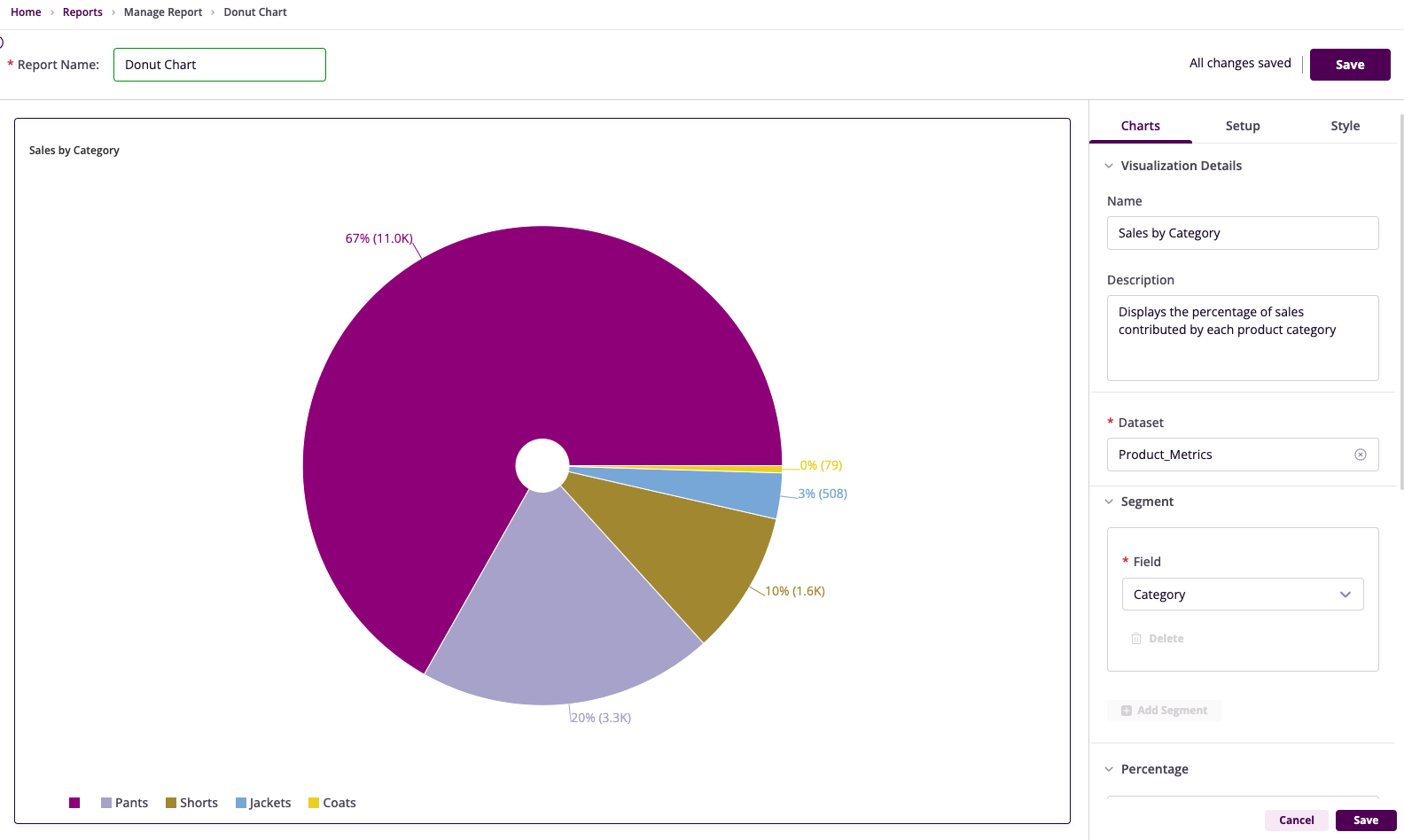
Donut Chart
An ideal choice for depicting proportions of a whole. Donut charts divide a circle into slices, where each slice represents the percentage that a specific category contributes to the total value.
Pie Chart
A classic tool for showcasing how individual categories contribute to a whole. Pie charts divide a circle into slices, with each slice representing a category's percentage share of the total.
Getting Started
Before configuring Donut or Pie Charts, ensure you have:
- A dataset with at least one categorical field and one numerical field
- A clear objective for the visualization
- Access to InsightsIQ and permissions to configure charts
Business Value
- Quickly identify dominant categories
- Highlight areas of interest
- Communicate insights in presentations and dashboards
Chart Configuration
Basic Configuration
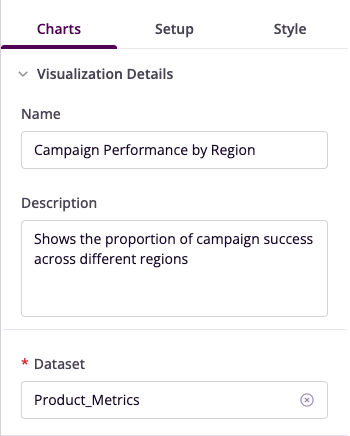
- Name: Provide a descriptive title
- Description: Add a concise explanation
- Dataset: Select the relevant dataset
Segment Configuration
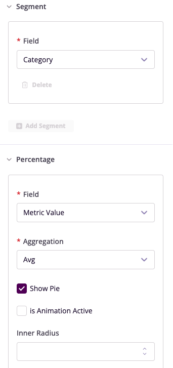
- Field: Choose the categorical column
- Add Segment: Configure multiple segments if needed
Percentage Display
- Field: Select numerical column for percentage calculation
- Aggregation: Choose summary method (Sum/Average)
- Show Label: Toggle segment labels
- Show Label Line: Enable connector lines
- Inner Radius: Adjust hollow center (Donut Chart only)
Advanced Features
Filters
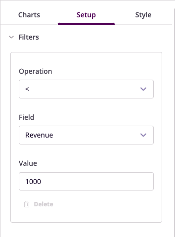
Configure data filters to refine your visualization:
- Operation: Select conditional operator
- Field: Choose column to filter
- Value: Set filter criteria
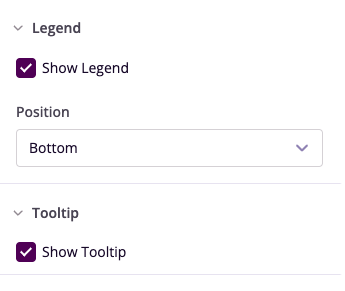
Legend and Tooltip
- Show Legend: Toggle visibility
- Position: Set legend location
- Show Tooltip: Enable hover details
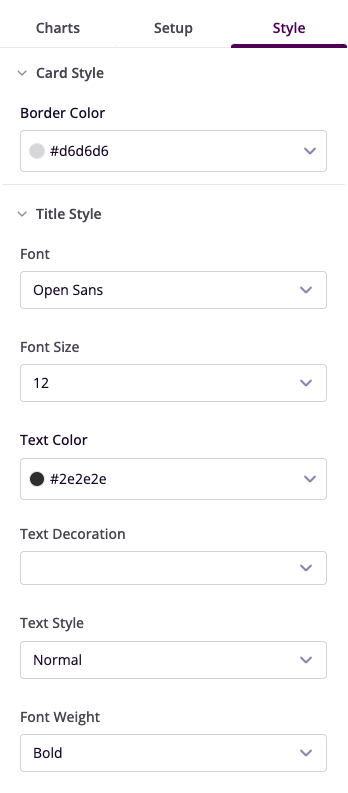
Style Customization
- Card Style: Adjust border and background
- Segment Colors: Customize individual segments
- Title Style: Configure font properties
Example Visualizations
Product Sales by Category
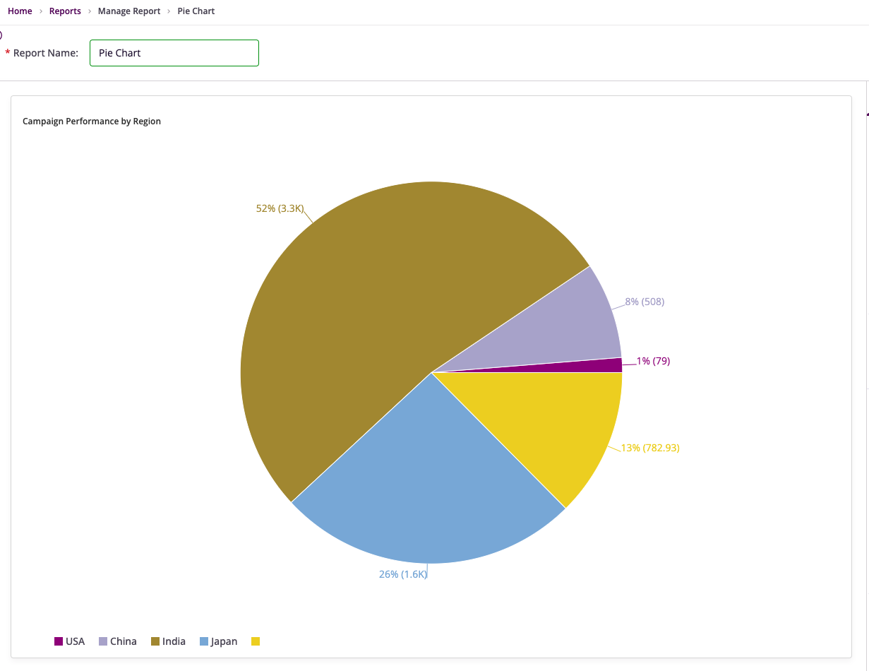
Campaign Performance by Region